← The UX Guide for Luxury Ecommerce Vol. 1
fashion · Shopify ·
Baum und Pferdgarten
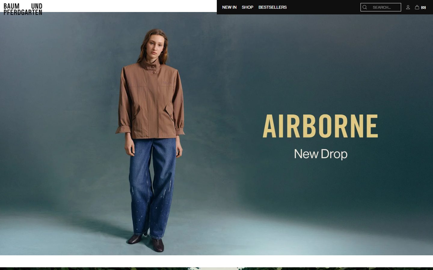
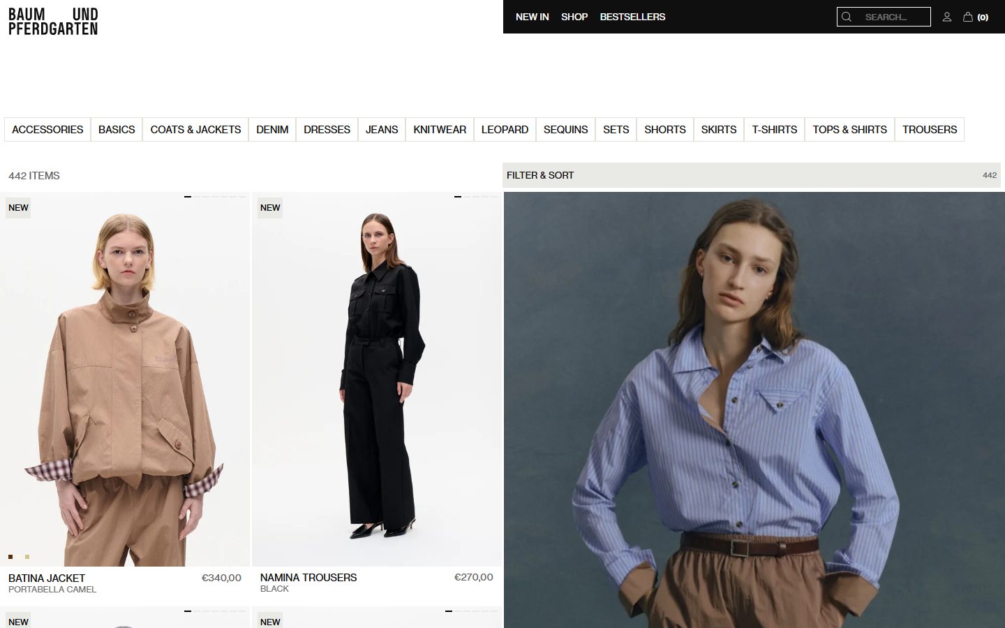
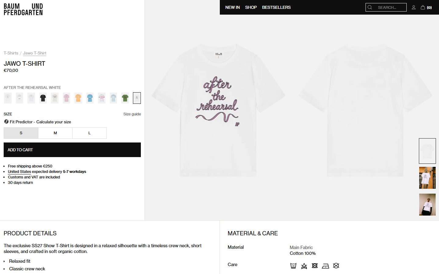
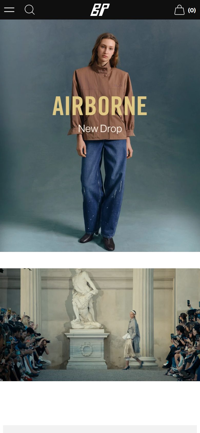
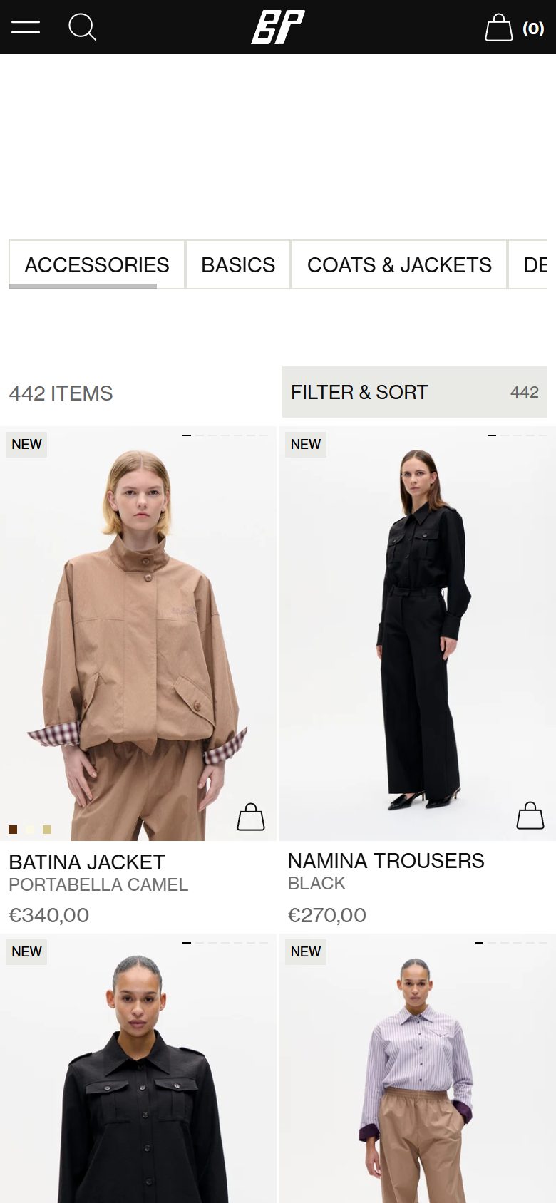
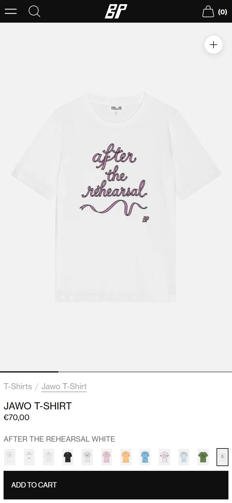
The Baum und Pferdgarten storefront measured page by page: homepage, collection and product at desktop and mobile, every color weighted by the share of the page it paints, with photography covering 57.9 percent of the page, typeset in neue-haas-grotesk-text, neue-haas-grotesk-display.
The pages
desktop1440 x 900
mobile390 x 844
Palette
Surfaces, by share of painted area
86.9%
12%
86.9%
#ffffff
page
12%
#0f0f0f
dark bands
0.8%
#e9e9e6
secondary surface
0.3%
#e4e4e4
secondary surface
Ink, by share of text set in it
70%
20%
70%
#0f0f0f
body and headings
20%
#656565
emphasis
7.9%
#000000
emphasis
2.1%
#ffffff
reversed on dark
Imagery, by share of the page it covers
57.9% photograph, the rest is surface
Typography
sans-serif · everything
neue-haas-grotesk-text
sans-serif · accent
neue-haas-grotesk-display
of all text on the page
100% sans-serif
Ecommerce components, rebuilt to spec
Add to cart
- Type
- neue-haas-grotesk-display 13px / 400 / 0.13px tracking / uppercase
- Color
- rgb(255, 255, 255) on rgb(15, 15, 15)
- Shape
- 0px radius, 12px 6px 9px 12px padding, 48px tall
- Width
- 450px as rendered
Product card
- Grid
- 176 across, 719px wide