The UX Guide Vol. 1: Luxury Ecommerce
For CRO Strategists, UX Strategists, Ecommerce Teams and Chief Digital Officers who need to ground a storefront decision in something firmer than taste.
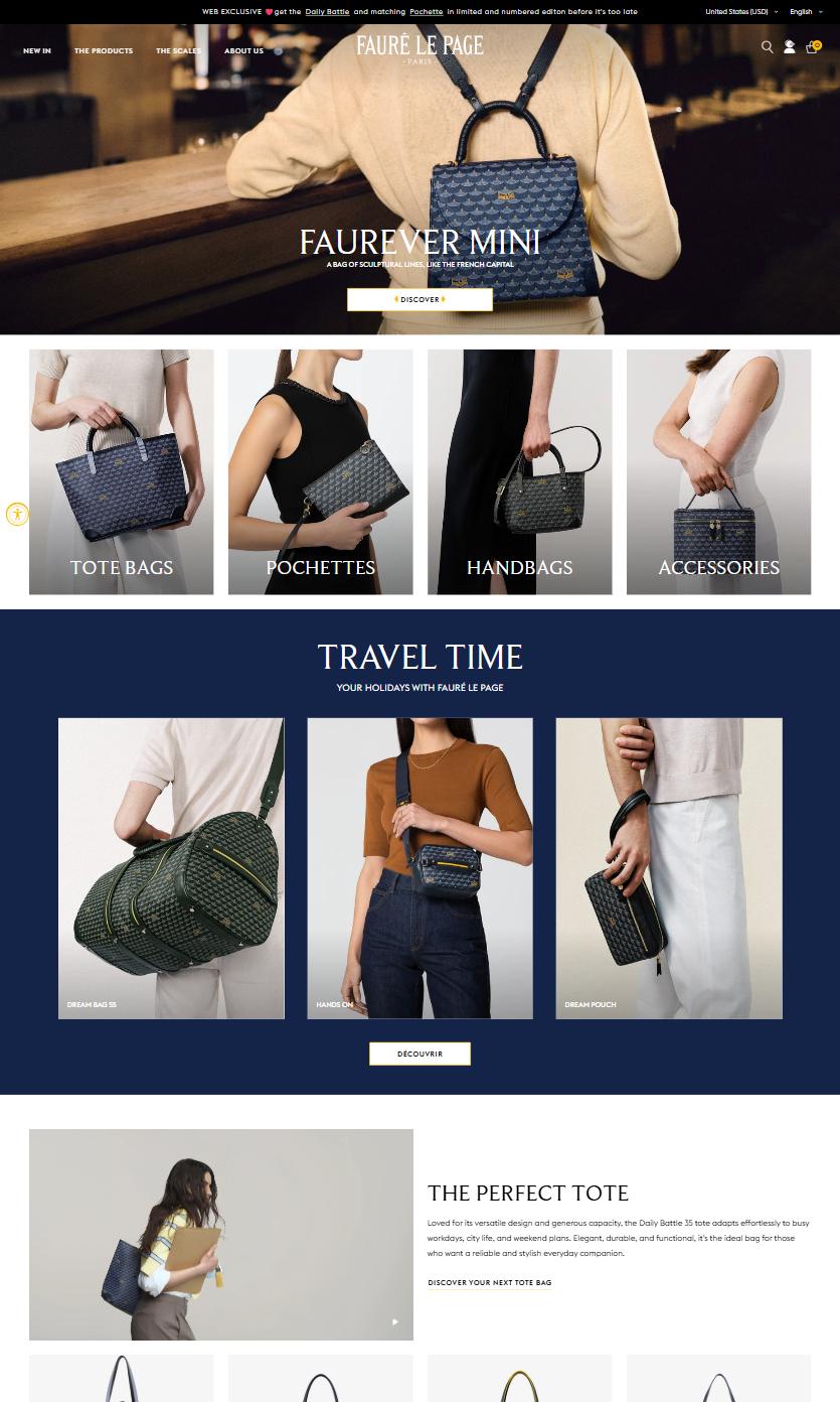
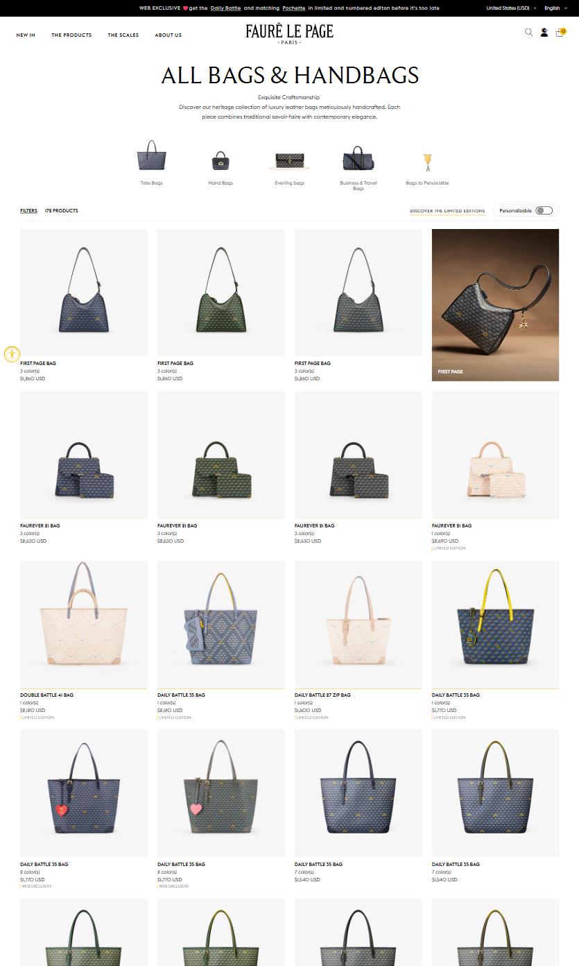
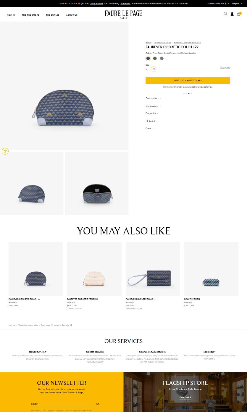
The details of a page matter, and when layouts need to change the design references you want are never within reach, until now. This is a compendium of the way luxury brands across the internet have settled those details, from the homepage to the collection page to the product page, on desktop and mobile.
Use this guide to spark an idea, to find the category norm, to place your own storefront against it, and to check an assumption before it costs you a sprint.
How to use this
Each component page is one decision, sorted along the axis that decision runs on. The add to cart buttons go from the roundest corner to the squarest. The inks go from the lightest grey to black. The category norm is the middle of the list, and your own storefront sits somewhere on it, which is a faster answer than a meeting.
Every value here came off a live storefront rather than a style guide, and every rebuild is shown next to the photograph it was built from. When the two disagree the photograph wins, and where a rebuild could not be made to match it is withheld and said so. That is the point of the pairing: a number you can quote in a review, with the evidence attached.


